RAINBOWS,
BUTTERFLIES, AND PEACOCKS
Work commenced on the color project during the summer of 1956. In contrast to the controlled chaos of the adjacent NBC television studios at Rockefeller Center, Graham's space on the seventh floor was a tranquil environment shared with the NBC art directors. The office was an assemblage of drafting tables, tacked-up storyboards, and lots of scissors and paste (the norm 40 years before the digital age).
Graham knew from the start that his logo would need to have as much impact in black and white as it would in color. To ensure that monochrome viewers got the Peacock's message, Graham made frequent use of the color television equipment located in Studio 3H to ensure that his renderings were well chosen for viewing on color and black and white receivers.
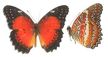
Graham pondered the possibilities of color themes, and most likely bypassed the rainbow as too obvious. Turning to nature for inspiration, it didn't take long for him to arrive at a wonderful color symbol: The butterfly!
Butterflies, with their pastel, graceful shapes, are universally loved by humans. They are the essence of beauty and tranquility. Yes, the 'NBC Butterfly.' Nope. Butterflies, while lovely, are also too tame for television…more than a little on the 'soft' side. (45 years later, the butterfly would indeed become a logo for MSNBC.)
At home, Graham discussed the ongoing process with his then-wife Candella. Brainstorming over the animal kingdom, ideas flew back and forth. Images of parrots, flora, and fauna floated in the air until Candella suggested the peacock.
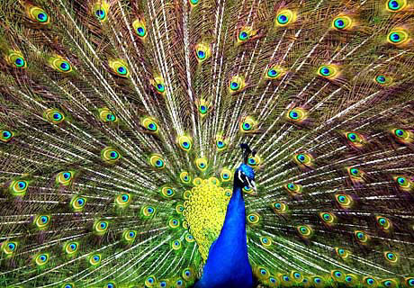
Peacocks, known for their bright plumage and regal, elegant gait, were definitely more interesting than the butterfly. Everyone knew what it meant to be "proud as a peacock." When the male bird spreads his colorful feathers for all to see, it's always a very dramatic, attention-getting moment. Still, positioning a 'glorified fowl' as the symbol of the network would provide Graham with a unique artistic challenge.
Graphic design in the mid 50's was exploding with color, forms, and ideas. Exaggerated shapes (the 50's 'boomerang', for example), overlapping hues, and wild new typefaces were being used to create visually arresting graphics. Graham's first rendering reflected this trend when he envisioned a very avant-garde peacock outline with pigeon-feet. The body was backed by eleven feathers highlighted with splashes of color. Sort of 50's 'moderne'. And probably a little too far out.
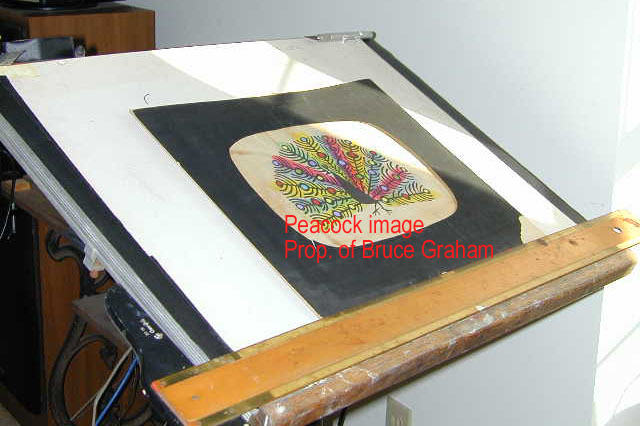
THIS ONE-OF-A-KIND PEACOCK PROTOTYPE DESIGN WAS CREATED IN 1956 BY JOHN
J. GRAHAM
AND APPEARS EXCLUSIVELY ON BIG 13. THANKS TO BRUCE GRAHAM.
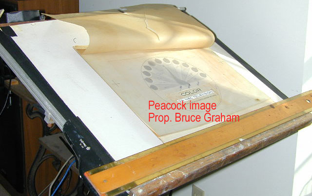
TAKING SHAPE! THE NBC PEACOCK ON GRAHAM'S DRAFTING TABLE IS ALMOST
COMPLETE.
THANKS TO BRUCE GRAHAM.
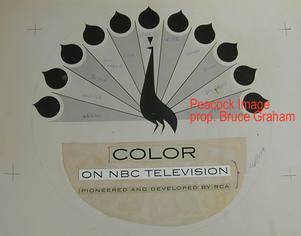
GRAHAM'S PEACOCK DESIGN WITH HIS HAND-WRITTEN NOTES ON COLORIZING FOR EACH
FEATHER.
NOTE THAT GRAHAM'S LIGHT COLOR/DARKER COLOR CONCEPT WILL ALSO
READ WELL IN BLACK AND WHITE.
Thanks again to Bruce Graham!
Graham's Peacock was feathered in six colors -- maroon, orange, yellow, green, blue and violet. To ensure that nothing interfered with the Peacock's visual impact he was placed over a solid black background. This first Peacock was simply a piece of flat artwork photographed on color film and mounted onto a slide.
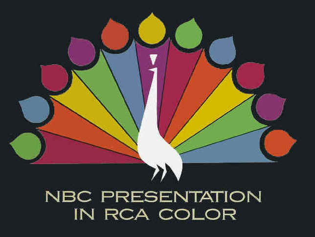
The First Peacock, as introduced in 1956
Appearing on the air for the first time in September, 1956, the Peacock immediately served as an attention-getting device: "Hey, you could be watching this show in glorious color!" Recognized by viewers and the television industry as NBC's symbol of color, pride, and excitement, the Peacock was a success and led Graham to use his storyboard talent to create an animated version.