ART FOR ART'S SAKE
Channel 24’s classic logo was designed by Thomas Petry’s wife Eve, a talented graphics artist. Based on a Japanese family crest representing a stylized hollyhock, the logo was hand-painted by Mrs. Petry with off-white tempra onto grey board. The final version appeared on-air, in publications, and was applied to the side of studio and remote equipment.
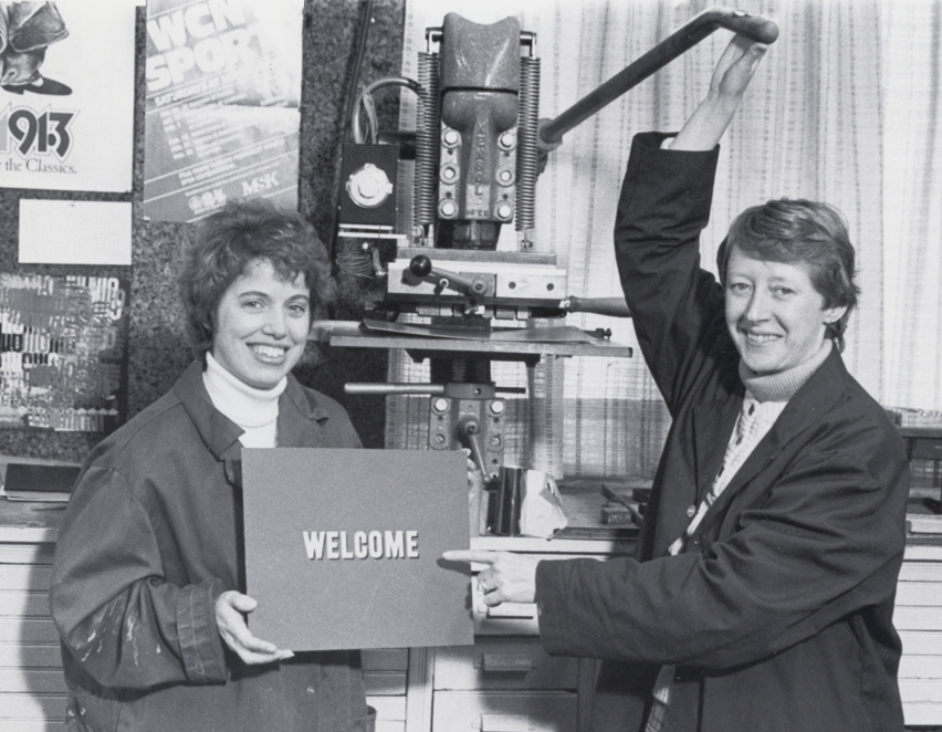 |
The station's staff art director, Steve Meltzer, was in charge of the pre-digital graphics used on the air and in WCNY publications. Graphics were created the old-fashioned way with hot-press lettering machines, cut-out photos, razor blades, scissors and glue. The hot press machine was a 450 pound behemoth that would literally melt type onto the art board. Left - Two volunteers demonstrate the heavy-duty Kenson hot press machine, used to create graphics and title cards. |
| Right - Steve Meltzer provided the charming wood-block illustration appearing on the March, 1969 cover of WCNY's monthly publication Televiews |
|
|
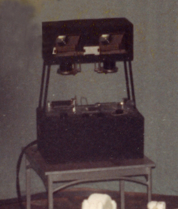
Meltzer was kept busy supplying a steady stream of station I.D. cards along with credit rolls, program titles, and transparencies for use on the studio’s rear projection (R.P.) system, a sophisticated slide projector. Like the hot press machine, the R.P. was another imposing looking piece of equipment; a ‘Rube Goldberg’ contraption consisting of a stove-sized base topped with glass plates and mirrors that projected artwork onto a large translucent screen. Using the R.P. gave studio presentations an extra visual element by placing graphics adjacent to WCNY’s on-camera hosts. Right - The imposing-looking but handy rear projection system |
|
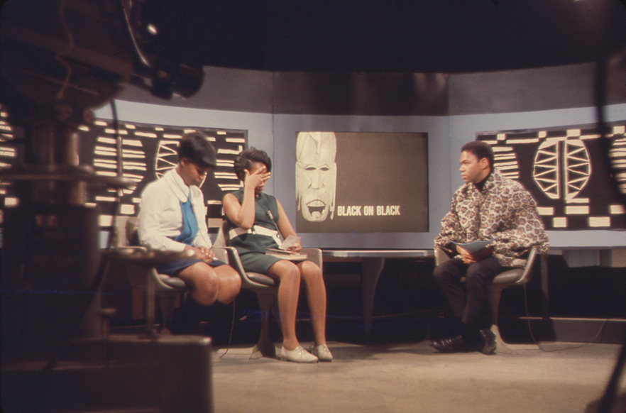
THE REAR-PROJECTION SYSTEM WAS A VERSATILE TOOL FOR BRINGING GRAPHICS
ONTO THE SET OF BLACK ON BLACK AND OTHER WCNY PROGRAMS